Understand your area
Open Hotspotty from the main landing page and you'll see the map of your area and the positioning and status of the hotspots within it. Use the appearance settings cog in the top right corner to choose your preferred visualization setting.
Hotspotty provides different visualization settings to help you analyze your area based on the question you seek to answer. For example, in the appearance settings you can choose to visualize by online status, wallet verification status, rewards and witnesses. Some of these metrics are absolute (e.g. online = green, offline = red), whereas other represent the relative performance of a metric of choice among all hotspots in your area (the purple zone). The histogram at the bottom of the appearance settings displays the meaning of each color and specifies the boundaries of values as well as how many fall under each 'bucket'. You need to understand the chosen setting to read the map. We encourage you to try different settings, and recommend verifying your wallet to get the most out of the Hotspotty analytics and community tools.
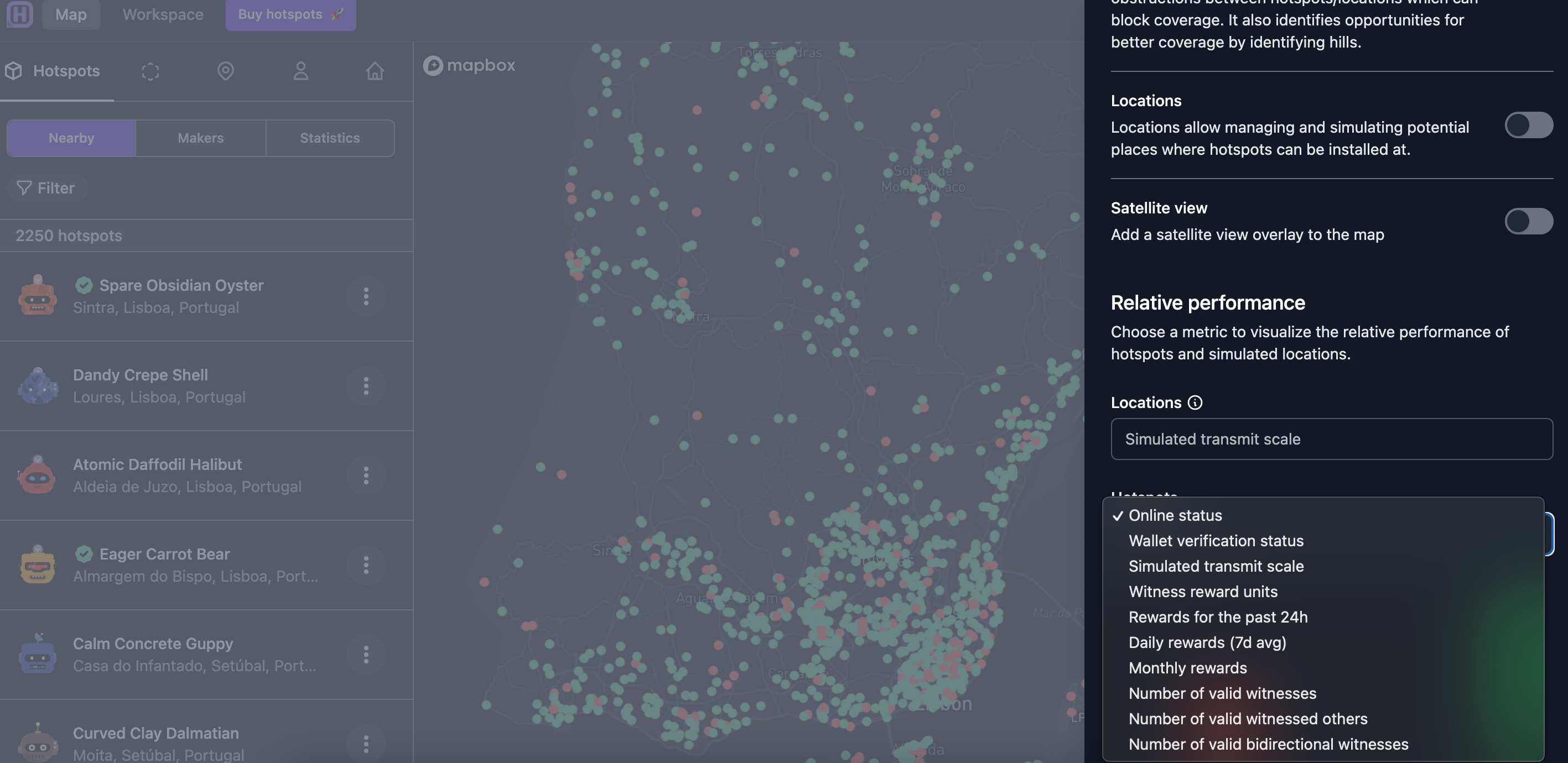
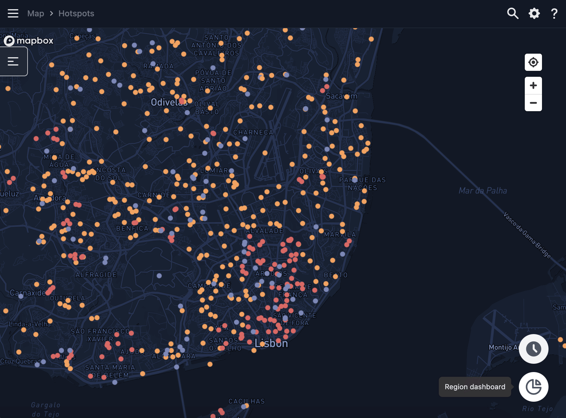
In the below example, we're visualizing by simulated transmit scale. Simulated transmit scale represents how saturated any given area is, and is there to help you understand whether it makes sense to add a hotspot to any given area.
Hotspot analytics
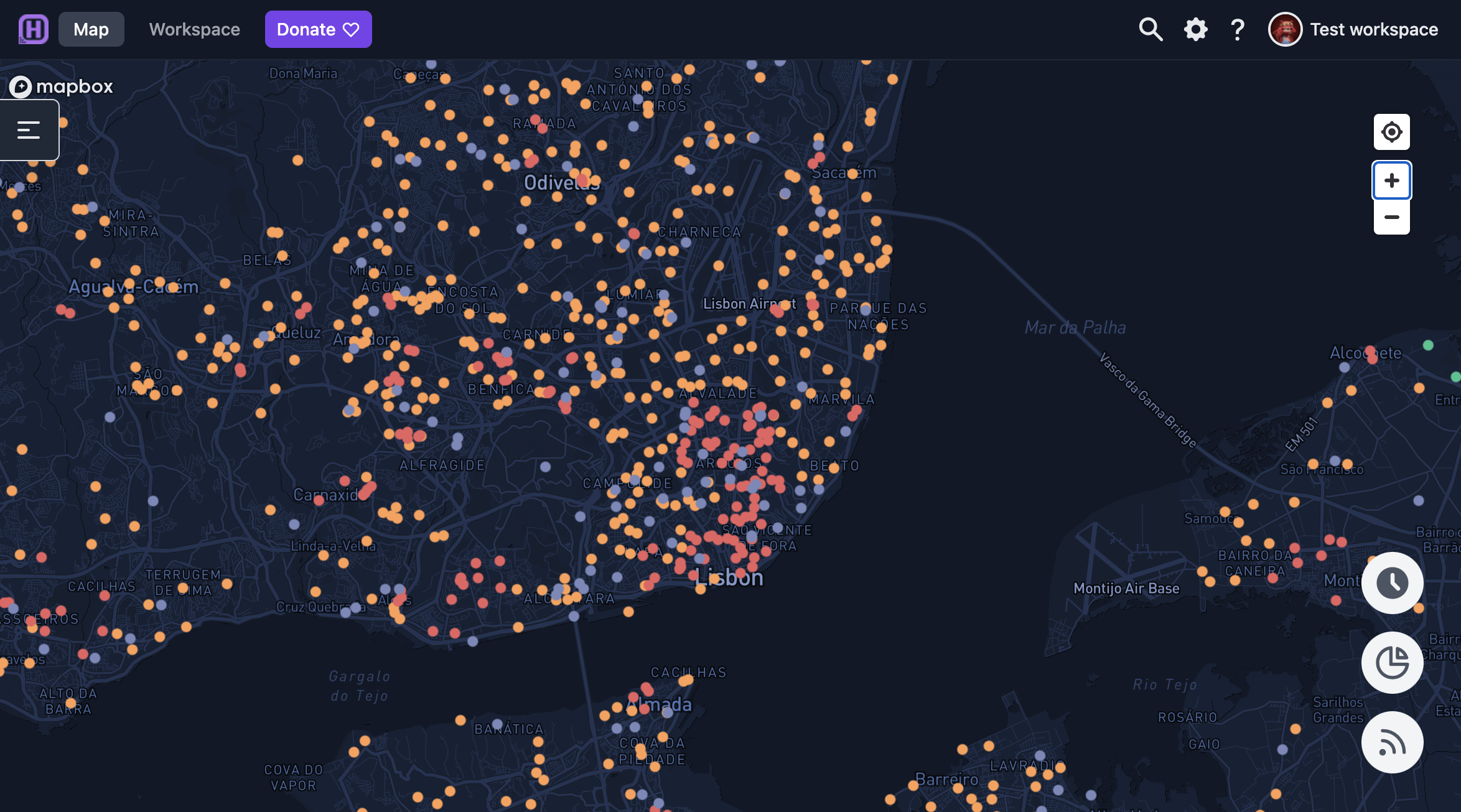
Zoom in and out of the map using the + / - symbols in the top right corner. When you zoom out sufficiently, you will see the purple hex that defines the outer borders of the area that's being viewed. You can move the purple hex or use the magnifying glass to search for specific locations, hotspots or contacts. The map will move to the desired location, hotspot or contact when you press enter.
Every dot on the map represents a hotspot as it is asserted in the Helium network or a location asserted in Hotspotty. The chosen appearance setting dictates the color scheme. The color of the dot corresponds with the hotspot status within the network. In the example below, we're visualising by the simulated transmit scale, and a green dot shows an active hotspot with an excellent transmit scale.
If you navigate to the layers cog in the bottom right corner you can read more about the different filters at the bottom of the page.
- Green - the hotspot is online and has an excellent transmit scale
- Yellow - the hotspot is online and has a mediocre transmit scale
- Orange - the hotspot is online and has a poor transmit scale
- Purple - the hotspot is offline or has recently been offline and/or is currently syncing
- Red - the hotspot is online and has a terrible transmit scale
Click on an individual Hotspot and you'll see its analytics including hotspot status, rewards, reward scaling, hotspots witnessed and other information.
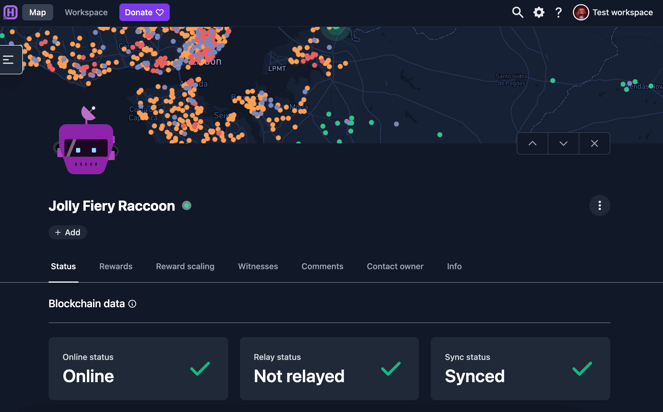
You can contact a hotspot's owner under Contact Owner tab when you click on an individual hotspot. We recommend that all users verify their wallets to enable a smooth and easy communication among hotspot owners globally.
See more on Add your Solana wallet
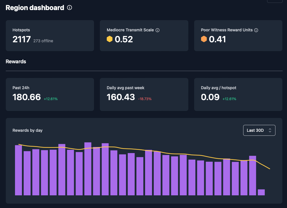
Regional dashboard
You can also analyze and compare hotspot performance in any given geographic area. Go to Map and press the Region Dashboard in the bottom right corner.
The region dashboard shows hotspot performance within the area, including the HNT rewards generated and a list of hotspots that require attention.